
Once your indicators are configured, you can choose how you want your data to be displayed.
Which graph to choose for the indicators?
When creating the KPI, it is up to you to choose the graphical representation of the indicator.
Indeed, there are two ways to display an indicator :
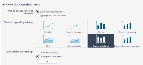
- Data evolution : the display is done as curve with a time axis :
- Aggregation of the data : the display is made in the form of average (or a sum) over the last 15 days for example :
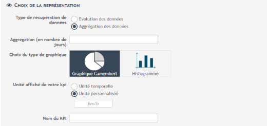
In the configuration of your indicator, depending on the number of axes you have defined, you will be offered several different types of graphs.
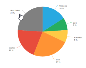
Thus, if you have only one main axis, the aggregated data will be presented as a simple indicator, whereas with an additional axis, “Customer satisfaction” for example, you will have a pie chart data.
Criteria for displaying the graphic
In the configuration, you can define different display criteria.
Apart from the name of your indicator, you can add a unit to it.

- Time unit : The unit displayed will be the one you set when you filled in the unit for durations field at the beginning of your flag configuration.
- Custom Unit: Fill in the corresponding field. This is the unit that will be applied to your values when you look at the graph of your indicator, as well as on the Y-axis.
Single-axis graphical representation
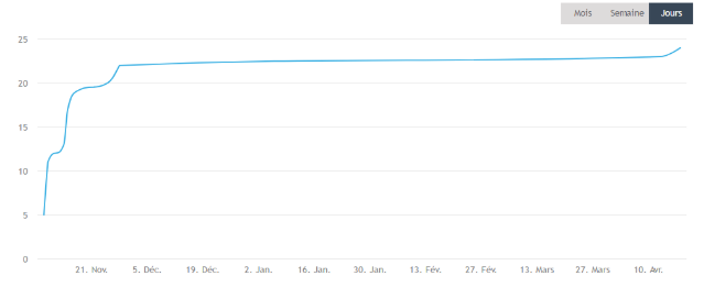
With a graphical representation on a single axis, you get the value of your indicator as a function of time only.
This is the case for the set of KPIs created from indicator models, as well as in advanced mode if you have not chosen secondary axes.
Aggregated data (Data aggregation)
The simple indicator
Example: Consider that your indicator is the count of the number of executions of your process.
If you choose aggregated data, the indicator will be summed up to one digit. In our example, it will show the number of times your process has been run over the last 30 days. It is up to you to define how many days you want to aggregate your data over.
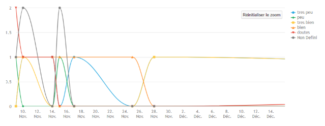
Non-aggregated data (temporal evolution)
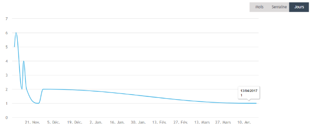
*Simple graph: One point or bar per time entry. These graphs read as “on 23/09/2017 my process was executed 10 times”.
**Graph with data cumulated: In these graphs, the value displayed is the sum of the value of your indicator since the first data retrieved. These graphs read as “on 23/09/2017 my process has been executed 100 times since 04/05/2017”.
For example, if you have one process run on Monday, three on Tuesday and none on Wednesday, the cumulative count of the number of processes displayed will show 3 ( 1 + 2 ) on Tuesday and 3 ( 1 + 2 + 0 ) on Wednesday.
Multi-axis graphic representation
Only one secondary axis
If you have defined your indicator with only one secondary axis, here are the different types of graphs available:
Aggregate data
Non-aggregated data
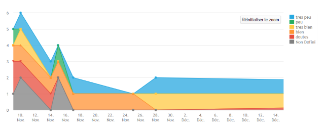
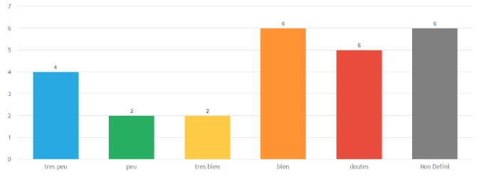
Several secondary axes
If you have defined several secondary axes, only one type of graph is offered.
This graph presents your data according to each of your study axes.
For example, let’s imagine that your axes are time, a customer satisfaction survey and a type of action carried out. If you move your graph to see your data according to customer satisfaction and click the bar If the customer has chosen “dissatisfied””dissatisfied”, you will have access to your KPI data for cases where the customer has chosen “dissatisfied” .
Then, if you click on a date (e.g. 23/09/17), you will see your data based on the actions taken at the time your customer was “dissatisfied” and having taken place on “23/09”.
This mechanism allows you to have an extremely precise look at your data.

